NinjaDoc Posted February 6, 2015 Report Share Posted February 6, 2015 (edited) Just wanted to share some logos for your consideration. Will keep updating with more and more designs. Always preferred a black and white design (just added a tinge of red in this one) which will look clean on both light and dark colored shirts as we choose. Also can make this in color if majority prefers in that way. But Color prints will be costly i guess. These are just some of my suggestion, final decision up to derek and you guys. Edited February 19, 2015 by NinjaDoc Quote Link to comment Share on other sites More sharing options...
DAC Posted February 6, 2015 Report Share Posted February 6, 2015 Wow. Really nice! Only suggestion is maybe make the May 2015 bigger. Quote Link to comment Share on other sites More sharing options...
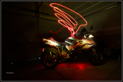
snot Posted February 6, 2015 Report Share Posted February 6, 2015 I like the cafe style...can't wait to see what else you come up with. Quote Link to comment Share on other sites More sharing options...
rollnhot Posted February 6, 2015 Report Share Posted February 6, 2015 I am in possession of a pic of Casper on my front lawn in his underwear. May not look so good on a hoodie. But still damn entertaining. Quote Link to comment Share on other sites More sharing options...
NinjaDoc Posted February 10, 2015 Author Report Share Posted February 10, 2015 (edited) Really Put some effort to come up and complete this one, i am not much into skulls but i know its one of the most iconic part of motorcycles hope you guys like it Edited February 10, 2015 by NinjaDoc 1 Quote Link to comment Share on other sites More sharing options...
Grokked Posted February 11, 2015 Report Share Posted February 11, 2015 Really Put some effort to come up and complete this one, i am not much into skulls but i know its one of the most iconic part of motorcycles hope you guys like it [skull graphic] That's some nice artwork. Quote Link to comment Share on other sites More sharing options...
Wojo72 Posted February 11, 2015 Report Share Posted February 11, 2015 Thumbs up! Really Put some effort to come up and complete this one, i am not much into skulls but i know its one of the most iconic part of motorcycles hope you guys like it Quote Link to comment Share on other sites More sharing options...
NinjaDoc Posted February 12, 2015 Author Report Share Posted February 12, 2015 Wow. Really nice! Only suggestion is maybe make the May 2015 bigger. Thank you , in the image it looks smaller but imagine it relatively on an XXL T shirt. It will be pretty big. I like the cafe style...can't wait to see what else you come up with. Ty snot, Yea i always tried to stick with older bikes so that the logo is not biased towards new sportsbike or cruisers etc. Every one likes and respects old bikes i guess I am in possession of a pic of Casper on my front lawn in his underwear. May not look so good on a hoodie. But still damn entertaining. Share That's some nice artwork. Ty Thumbs up! Ty, i hope most people recognize the ohio map in that one and not just a skull Quote Link to comment Share on other sites More sharing options...
o-no-moto Posted February 13, 2015 Report Share Posted February 13, 2015 Doc the skull is pretty cool I myself am not into them that much but still killer work. I really dig the black hoodie and I think maybe a ohio riders logo is in order. Quote Link to comment Share on other sites More sharing options...
redkow97 Posted February 15, 2015 Report Share Posted February 15, 2015 If people are willing to drop the "epic" and just roll with "ride Ohio," there might be a much larger market for the skull design. Quote Link to comment Share on other sites More sharing options...
o-no-moto Posted February 15, 2015 Report Share Posted February 15, 2015 I was thinking more in the lines of keeping the epic ride logo ( I like tradition) and adding a ohio riders logo Quote Link to comment Share on other sites More sharing options...
JackFlash Posted February 15, 2015 Report Share Posted February 15, 2015 I think for legal reasons, the "Ohio Riders" name or logo shouldnot be a part of our rides, just in case there is an incident wherean injured rider may feel damages are due to them and a lawsutcomes up. The more legal distance between the website and rides we participate in, the better. That protects the website andCasper, as well. . 1 Quote Link to comment Share on other sites More sharing options...
NinjaDoc Posted February 15, 2015 Author Report Share Posted February 15, 2015 (edited) I think for legal reasons, the "Ohio Riders" name or logo shouldnot be a part of our rides, just in case there is an incident wherean injured rider may feel damages are due to them and a lawsutcomes up. The more legal distance between the website and rides we participate in, the better. That protects the website andCasper, as well. . 100% agreement / due to reasons already mentioned earlier and many others over the years keep this ride as an independent thing approachable to many other forums and lucid organization so no one can point fingers at any one. With that here is another one with traditional rider and ohio flag Edited February 15, 2015 by NinjaDoc Quote Link to comment Share on other sites More sharing options...
max power Posted February 15, 2015 Report Share Posted February 15, 2015 Ride Ohio is the name of another website. Quote Link to comment Share on other sites More sharing options...
Wojo72 Posted February 15, 2015 Report Share Posted February 15, 2015 Just sayin.......... RideOhio.com is for sale (Ride Ohio)Click here to buy RideOhio.com for $1,895 Quote Link to comment Share on other sites More sharing options...
JackFlash Posted February 15, 2015 Report Share Posted February 15, 2015 With that here is another one with traditional rider and ohio flag Should the logo distinguish between a spring rideand a fall ride that happens in the same year? . Quote Link to comment Share on other sites More sharing options...
JackFlash Posted February 15, 2015 Report Share Posted February 15, 2015 (edited) The word, "EPIC" indicates to me a special one time occurance related to a certain event. Is every ride going to be epic? Using the word "epic" every time seems to take awayanything special about our rides in general. These rides might then be viewed as,"Just another ride by those guys on that website." How about wording similar to: EPIC SERIESOhio Spring RideMay 2015 or EPIC SERIESOhio Fall RideSeptember 2015 or THE EPIC OHIO SERIESSpring Motorcycle RideMay 2015 ...or something along those lines? . Edited February 15, 2015 by JackFlash Quote Link to comment Share on other sites More sharing options...
NinjaDoc Posted February 15, 2015 Author Report Share Posted February 15, 2015 (edited) The word, "EPIC" indicates to me a special one time occurrence related to a certain event. Is every ride going to be epic? Using the word "epic" every time seems to take awayanything special about our rides in general. These rides might then be viewed as,"Just another ride by those guys on that website." this was started as a one time special ride / year . And just look it up as a "simple name" and like o-no-moto said i also like the idea of follow the tradition rather than us trying to dissect each component every time. But as always its a group decision. And i can change the logo name to spring 2015 instead of may 2015. Edited February 15, 2015 by NinjaDoc Quote Link to comment Share on other sites More sharing options...
Blitz Posted February 15, 2015 Report Share Posted February 15, 2015 (edited) I'm a graphic designer for a living, so I'm always looking for things to spark creativity and inspiration. I thought I'd play around with this for a bit last year for one of the rides and never got around to posting it. I just updated those to this ride. Not trying to stop on your toes NinjaDoc....hope you don't take it that way. Edited February 15, 2015 by Blitz 1 Quote Link to comment Share on other sites More sharing options...
Blitz Posted February 15, 2015 Report Share Posted February 15, 2015 (edited) And feel free to say you like NinjaDoc's better. I get my work criticized all the time, so I'm used to it. I was just playing around with a new style that you see used a lot currently. And I always like cafe racer silhouettes, hahaha. Edited February 15, 2015 by Blitz Quote Link to comment Share on other sites More sharing options...
NinjaDoc Posted February 16, 2015 Author Report Share Posted February 16, 2015 (edited) I'm a graphic designer for a living, so I'm always looking for things to spark creativity and inspiration. I thought I'd play around with this for a bit last year for one of the rides and never got around to posting it. I just updated those to this ride. Not trying to stop on your toes NinjaDoc....hope you don't take it that way. Very nice blitz, i like it simple and clean. I also just keep making it for fun. So your not stepping on my toes at all. The more to dance the merrier it is. Decision to choose is upto the rest of them. Would you mind if i combine ur second one with another picture? if so can u share the psd for that ? Edited February 16, 2015 by NinjaDoc Quote Link to comment Share on other sites More sharing options...
DerekClouser Posted February 16, 2015 Report Share Posted February 16, 2015 I'm liking the logo's so far... As far as the logo, I would definitely like a permanent logo with the ability to modify it slightly to include either the number of the ride (i.e. 5th Annual, etc) or the Date of the ride. This way things stay consistent, but have a slight difference included as well. So far I like the first one and I do like the skull one, even though I'm not really into skulls. As said before, we don't use the OhioRiders logo on the stuff for liability reasons. This isn't an OhioRiders sponsored event, but rather just using the forum as a medium of helping get everyone together and gathering opinions for routes, meet spots, dates, etc... I might have to get into this competition as far as the logo and put some time into coming up with some creativity. Obviously the 4 leaf clover wasn't a hit hah. Quote Link to comment Share on other sites More sharing options...
whaler Posted February 16, 2015 Report Share Posted February 16, 2015 I like Blitz stuff Quote Link to comment Share on other sites More sharing options...
o-no-moto Posted February 16, 2015 Report Share Posted February 16, 2015 100% agreement / due to reasons already mentioned earlier and many others over the years keep this ride as an independent thing approachable to many other forums and lucid organization so no one can point fingers at any one. With that here is another one with traditional rider and ohio flag This has my epic vote..lol Quote Link to comment Share on other sites More sharing options...
JackFlash Posted February 16, 2015 Report Share Posted February 16, 2015 (edited) I'm just playing with ideas here. Edited February 16, 2015 by JackFlash Quote Link to comment Share on other sites More sharing options...


Recommended Posts
Join the conversation
You can post now and register later. If you have an account, sign in now to post with your account.