im faster Posted July 8, 2011 Report Share Posted July 8, 2011 (edited) and then the next 3 you would click on and why. I need to make a banner and want it to be the most eye catching.. and if you have any ideas on how i should make it. http://i25.photobucket.com/albums/c63/mybuicksfaster/Temp/banners1-2.jpg Edited July 9, 2011 by im faster Quote Link to comment Share on other sites More sharing options...
Not Brian Posted July 8, 2011 Report Share Posted July 8, 2011 cold blooded. Eyes are attracted to bright empty space. none of them, I don't click on shit like that. Quote Link to comment Share on other sites More sharing options...
russian rocket Posted July 8, 2011 Report Share Posted July 8, 2011 Put a naked smoking hot chick in it and you will get 90% of internet users to click it. Quote Link to comment Share on other sites More sharing options...
Draco-REX Posted July 8, 2011 Report Share Posted July 8, 2011 HISS. Possibly because it's first. But I really think because it's simple, clean, and instantly readable so my brain picks up on it immediately. Quote Link to comment Share on other sites More sharing options...
Tripleskate Posted July 8, 2011 Report Share Posted July 8, 2011 HISS. Possibly because it's first. But I really think because it's simple, clean, and instantly readable so my brain picks up on it immediately. This. Edit...Or should I say "HISS". :gabe: Quote Link to comment Share on other sites More sharing options...
TimTaylor751647545500 Posted July 8, 2011 Report Share Posted July 8, 2011 HISS. Possibly because it's first. But I really think because it's simple, clean, and instantly readable so my brain picks up on it immediately. +1 Quote Link to comment Share on other sites More sharing options...
frenchy chan Posted July 8, 2011 Report Share Posted July 8, 2011 HISS. Possibly because it's first. But I really think because it's simple, clean, and instantly readable so my brain picks up on it immediately. this, too Quote Link to comment Share on other sites More sharing options...
BIGGU Posted July 8, 2011 Report Share Posted July 8, 2011 HISS. Possibly because it's first. But I really think because it's simple, clean, and instantly readable so my brain picks up on it immediately. again +1 it was the first one I saw. Quote Link to comment Share on other sites More sharing options...
zeitgeist57 Posted July 8, 2011 Report Share Posted July 8, 2011 Hiss, Gecko Time, Cold Blooded. Gecko Time is bright lettering on a vivid color background. Cold Blooded is bright in a sea of dark banners... Quote Link to comment Share on other sites More sharing options...
unfunnyryan Posted July 8, 2011 Report Share Posted July 8, 2011 Gecko time none of the others really caught my attention enough for me to realize what they said. Quote Link to comment Share on other sites More sharing options...
Nickey4271647545519 Posted July 8, 2011 Report Share Posted July 8, 2011 Gecko time none of the others really caught my attention enough for me to realize what they said. +1 Quote Link to comment Share on other sites More sharing options...
mrs.cos Posted July 8, 2011 Report Share Posted July 8, 2011 Gecko time. Quote Link to comment Share on other sites More sharing options...
Mr. Jones Posted July 8, 2011 Report Share Posted July 8, 2011 HISS Quote Link to comment Share on other sites More sharing options...
Buckeye1647545503 Posted July 8, 2011 Report Share Posted July 8, 2011 Hiss, Gecko Time, Cold Blooded. Quote Link to comment Share on other sites More sharing options...
Ramsey Posted July 8, 2011 Report Share Posted July 8, 2011 hiss, rept. gecko. didnt even see cold blooded. Quote Link to comment Share on other sites More sharing options...
coldsoda Posted July 8, 2011 Report Share Posted July 8, 2011 I agree with everyone else, the large letters stand out. barely even skimmed the other ones, the colors and font made it very easy to look right past them. Quote Link to comment Share on other sites More sharing options...
Avenger1647545502 Posted July 8, 2011 Report Share Posted July 8, 2011 HISS. Possibly because it's first. But I really think because it's simple, clean, and instantly readable so my brain picks up on it immediately. Same here...top left is where you start reading from. Then LZRDGRL and GECKO TIME due to the colors. Then EXTREME GECKOS because Papyrus is possibly the most annoying font ever...I should clarify, I SAW it...but I wouldn't click on it! Quote Link to comment Share on other sites More sharing options...
im faster Posted July 8, 2011 Author Report Share Posted July 8, 2011 Im attempting to make one in photoshop.. my issue is when typing with that small of font everything is blurry.. andy idea how to fix this? should i make it larger then shrink? Quote Link to comment Share on other sites More sharing options...
unfunnyryan Posted July 8, 2011 Report Share Posted July 8, 2011 Im attempting to make one in photoshop.. my issue is when typing with that small of font everything is blurry.. andy idea how to fix this? should i make it larger then shrink? set text antialiasing to strong Quote Link to comment Share on other sites More sharing options...
im faster Posted July 9, 2011 Author Report Share Posted July 9, 2011 Okay so ive worked on font and color... now i need to think of something else.. maybe outline text or the box? and maybe a smaller icon for the right? or should i center the font http://i25.photobucket.com/albums/c63/mybuicksfaster/Temp/banners1-1.jpg Quote Link to comment Share on other sites More sharing options...
mrs.cos Posted July 9, 2011 Report Share Posted July 9, 2011 forgive me for not knowing, but which one is yours? Quote Link to comment Share on other sites More sharing options...
wnaplay1647545503 Posted July 9, 2011 Report Share Posted July 9, 2011 Haus of powder, that damn banner attracts my eyes everytime its on the screen. I seen it before any of the ones you listed. Quote Link to comment Share on other sites More sharing options...
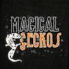
im faster Posted July 9, 2011 Author Report Share Posted July 9, 2011 Lol sorry Magical geckos bottom ro Quote Link to comment Share on other sites More sharing options...
Patterson Posted July 9, 2011 Report Share Posted July 9, 2011 Haus of powder, that damn banner attracts my eyes everytime its on the screen. I seen it before any of the ones you listed. LOL, I use that in several places. By far it has to be the most annoying banner I've made. Effectively making a great tool. It's also why I took it out of my Sigs. It drives me crazy. The colors worked perfectly. Quote Link to comment Share on other sites More sharing options...
Patterson Posted July 9, 2011 Report Share Posted July 9, 2011 I like the colors and font style for JMG. Quote Link to comment Share on other sites More sharing options...


Recommended Posts
Join the conversation
You can post now and register later. If you have an account, sign in now to post with your account.